HUD (Head-Up Display)
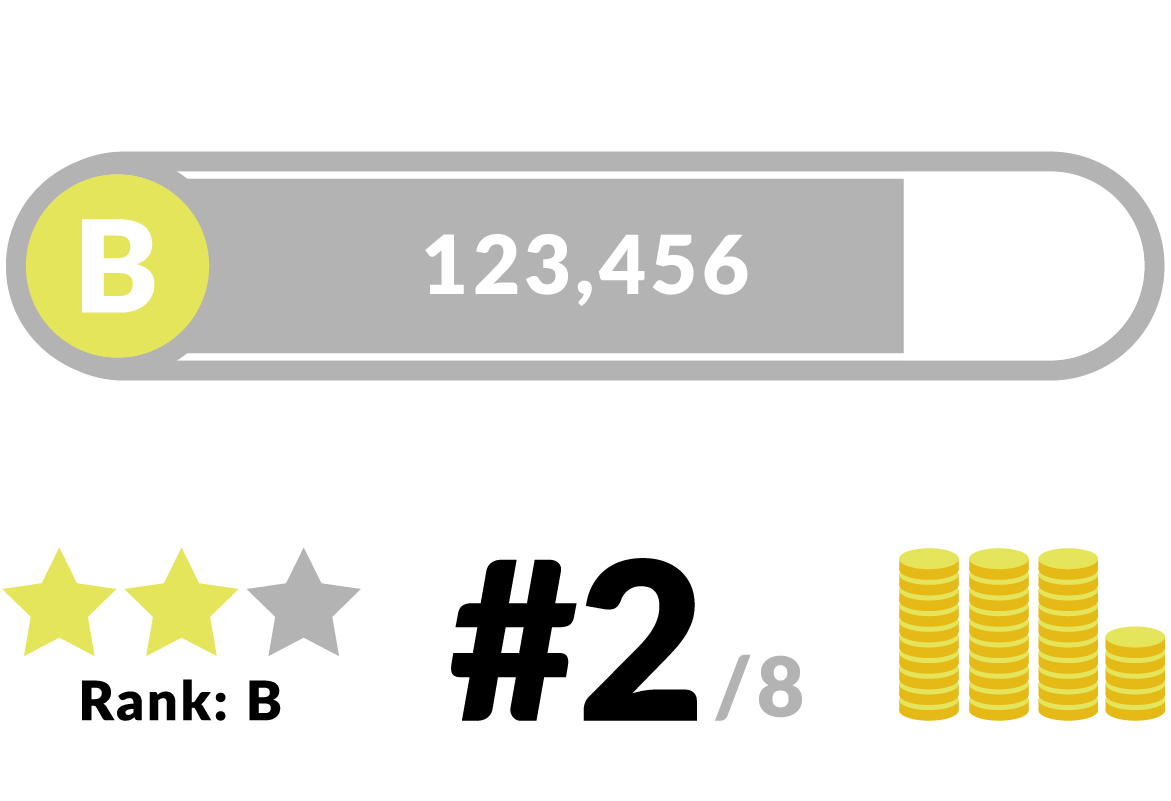
A HUD (sometimes called a status bar) is typically a transparent interface overlaying a game. It communicates important information to the player without them having to look away from the gameplay or open a menu.
Best practices for HUDs
Ideally, players should be able to customize the size and placement of all the elements of a game’s HUD to their liking. Not only does this help your dedicated, advanced players fine-tune their game, it helps players with low vision or a narrow field of vision clearly see what’s going on.
Developing a user-customizable HUD can be too time-consuming for some game developers. Providing an option to scale the entire HUD is a good alternative. If that’s not possible, use smart design to create interface elements that are clear, readable at a glance, and accessible to everyone.
Health
At-a-glance design
A number and a graphic representation of the player’s health is ideal if the player character has a high number of health points. This lets players assess their health as a percentage at a quick glance, while getting more precise information about how much damage they are taking.

Show acceleration through animation
Numbers alone don’t show acceleration very well, so a graphic such as a bar or row of hearts show how quickly a player is losing health without them having to do much mental math.

It's easy to tell how fast you're losing health in the original Mortal Kombat (1992) by inferring from the speed of the health bar.
Multisensory & diegetic health displays
Make sure you’re using audio to reflect health loss and gain too, so players with low or no vision can tell when they’re taking damage. This helps all players focus on the gameplay instead of looking at the UI, too. With a little creativity, there are clever ways to indicate health diegetically without using a HUD element (think Super Mario Bros., where Mario gets smaller when he takes a hit).

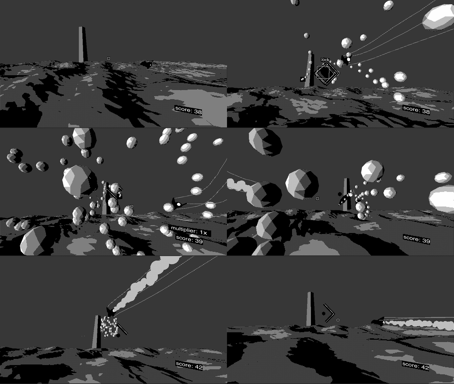
In Monolith, smoke trails on the player's ship indicate how many hits they can take.
Secondary Stats
At-a-glance design
For secondary stats, like experience points, mana, stamina, ammo, etc., displaying a graphic representation and a number is also ideal so that players can keep their focus on the game. Bars are a classic way of showing this, but consider more creative solutions too, like dials, ammo clips, piles of coins, and so on.

Multisensory & diegetic statistics
For extra immersion, think of ways you can indicate secondary stats diegetically (within the game itself) instead of on the HUD, especially if you have lots of them. Can you visually express a character’s stamina by showing them getting tired and panting, rather than representing it with a bar?

In Celeste, Madeline's hair color changes to indicate when the player needs more stamina to perform a dash.
Score
Prominence
How important is the score in your game? Is it something better left to the results screen, so players feel more immersed in the game? Or are combos and multipliers a huge part of gameplay? Design the size and prominence of score elements according to how important they are to gameplay.

Audio Feedback
If score is important to your game, make sure to double down and feedback and use audio to let the player know how they're doing, like ascending musical notes or louder sound effects when the player scores big combos, or using a voiceover to cheer them on.

The combo markers in Zap Herder are almost too frenetic to comprehend, but each combo is narrated by a voiceover to relieve visual stress.
Timer
Readability
Like other stats, it’s easier to read a visual timer than a numeric one. Use animations and juice to let players know when time is about to run out. Think about what the timer could represent in the game world: a dynamite fuse, a kettle coming to boil, the day/night cycle, etc.

Audio Feedback
Ticking sounds are trite and can be annoying to many players, so you may be better off creatively incorporating sound into your in-game environment instead.
In addition to the hourglass UI in Merrily Perilly, the music speeds up and gets more frenetic as time runs out.
Crosshair
Customization
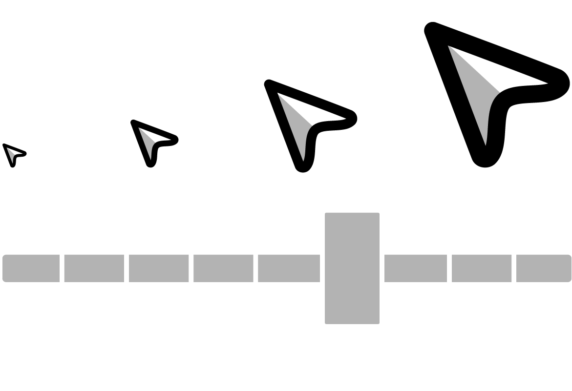
Ideally, players should be able to customize the size, shape, and color of the crosshair in the menu. Not only does this benefit the pro players who are playing your game with maximum efficiency in mind, it helps new players and players with low vision see where they’re aiming when they can choose a big crosshair.

Crosshair as Compact HUD
Vary the crosshair thickness, color, and shape to indicate the spray radius, recoil amount, cooldown or other statistics for unique weapons in your game. You can animate the crosshair to indicate hits, critical hits, or other actions too, since the player’s eyes are generally focused on the center of the screen anyway.

The crosshair in Playground places an X where an opponent is hit, which is handy since other players can be too far away to see in detail.
Cursor
Style
The style of your game’s pointers and cursors are an opportunity to reflect the style of the game in the UI as well as show the player which actions they can take.

Accuracy
Make sure your pointers indicate exactly where the user is expecting to point -- otherwise, players may find the accuracy of your pointers to be frustrating and buggy. If your cursor is a dot, how big is the dot’s hitbox? Are your players accidentally clicking on things in user testing?

Cursor as Compact HUD
Creatively, you can have multiple cursors to indicate different actions. Just like how hovering over links changes the user’s cursor to a hand in a web browser, think about how else you can give the user feedback about which UI items and in-game objects they can and can’t interact with. Always include audio and visual feedback so the player knows when their input succeeds or fails.

Games in the Sims series utilize dozens of different cursors to signify what actions the player can take, such as moving the player, moving the camera, or interacting with objects.
Accessibility & Compatibility
Ideally, players can customize the size of pointers and cursors so players with low or no vision can see the cursor. This also benefits players using high-resolution monitors, who often suffer poorly-scaled, tiny UI. Be careful about relying on the cursor as the sole visual indicator of action if you’re going cross-platform, since mobile games with touch input don’t generally have cursors.

