Status Effects
Status effects are stylized differently from genre to genre, but nonetheless it's important that they stand out from the background both visually and aurally so players understand what forces are affecting them.
Best practices for status effects
Many developers make the mistake of relying on color alone to convey status effects. Between 5% and 8% of men have some kind of colorblindness, so using color to differentiate friendly units from enemy units could make your game unplayable for millions of people.
Fortunately, there are common visual design elements and principles that you can use to communicate status effects to your players. Instead of color, you could use shapes, icons, textures, animations, sound, haptics, and myriad other ways of differentiating game objects.
Buffs/Debuffs
Colorblind-friendly design
Many games use colored, glowing auras to indicate that characters are buffed or debuffed, but if not done carefully, these can blend in with the background and get overlooked. Consider using an animated texture instead, like rising flames or bubbles.

Iconography & Sound
Icons are often more descriptive but less immersive since they are non-diegetic, but are a good option to include in game settings if players with vision disabilities are having issues. Use unique sounds to describe each status effect, and make sure you’ve made it clear when each effect begins and ends.

Normally in Team Fortress 2, the Jarate effect is shown as a yellow tint to a player character. In colorblind assistive mode, the jar is displayed above a player's head.
Damage/Healing over Time
At-a-glance information
Some players may not be able to see their health bar and the game at the same time due to mobility issues or low field of vision. Improve their experience by applying visuals to their character or cursor at the center of the screen, or using full-screen effects and audio. All players should be able to tell when they are taking continual damage over time, or they may find the game too unforgiving.

Multiple layers of feedback
One option is using animated effects like flashing the character or surrounding them with sparkling particles. For more immersion, use character animation to show a player grimacing or sighing in relief. Always use sound and animation to indicate when the effect begins or is about to end so that players feel like it’s fair.

In The Legend of Zelda: Breath of the Wild, Link takes damage when the weather is freezing. The player can recognize Link's expressive posture and grimace, the sound of his chattering teeth, his visible breath, and the temperture gauge UI.
Invincibility
Fairness
A common way to show invincibility is to flash the character sprite with different colors and play frenetic music. But don’t forget to let players know how long the effect will last or when their invincibility is about to end. No one likes running into an enemy thinking they’re invincible when the effect has run out one frame beforehand.

Timer Feedback
Many games fade the music and animation over time as a player’s invincibility is running out, while others flash the sprite more rapidly or draw a particle trail that reduces in size. You’re afforded a lot of creativity in how you indicate invincibility, but remember to include both visual and audio cues so no one gets frustrated.
Players can tell when invincibility ends in Crash Bandicoot because the music gets faster and the Aku Aku mask flies awak from Crash's face.
Cooldowns
Visual Design
Any time you have a timer in a game, think about representing it visually, such as a bar or clock. This way, players get an idea of how quickly a skill will cool down without having to count or read anything.

Audio Design
Skills generally have three statuses: available, in use, or on cooldown. Make sure you have unique sounds to represent all three of these statuses.
Each weapon in Team Fortress 2 has unique sound effects and animations for reloading, which is a type of cooldown that lets the player know the weapon is disabled.
Hit markers
Positive Feedback
Hit feedback is important for letting players know whether their actions have landed or missed. Without positive or negative feedback, they can be confused or discouraged from playing.

In Super Sellout, each successful hit is stylized with a comic-book-esque "POW!" and accompanying sound effect.
Critical Hits
Mechanics
Critical hits should be challenging and the feedback should feel special. Make it clear to the player how they can achieve a critical hit, whether that’s through tutorialization or creating visually obvious hot spots.

In Wobolob, players know when the ball rewards extra points because it gets smaller, faster, and darker in color.
Positive Feedback
Use sound and animation to differentiate it from a regular hit, and consider using a celebratory tone to create a positive feedback loop.

Accessibility
Don’t make precisely-aimed critical hits a required part of gameplay if you want to be inclusive of people with disabilities -- some people don’t have the dexterity or visual acquity necessary and it could keep them from progressing in the game.

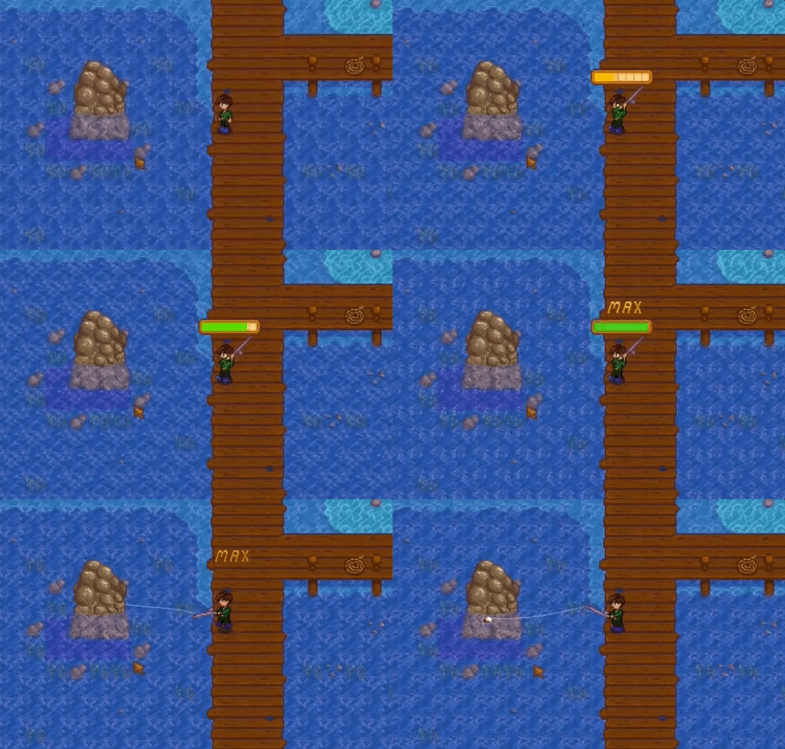
When a player times the fishing meter in Stardew Valley just right, they get a little bonus to their fish size, but it's not necessary to beat the game.
Area of Effect (AoE)
Visual Indicator Accessibility
Players should understand the size of an area-of-effect skill before they use it, so make sure it’s clearly indicated and stands out from the background.

It's hard to miss the AoE effect in Diablo II because of its brightly contrasted, expanding ring around the player.
